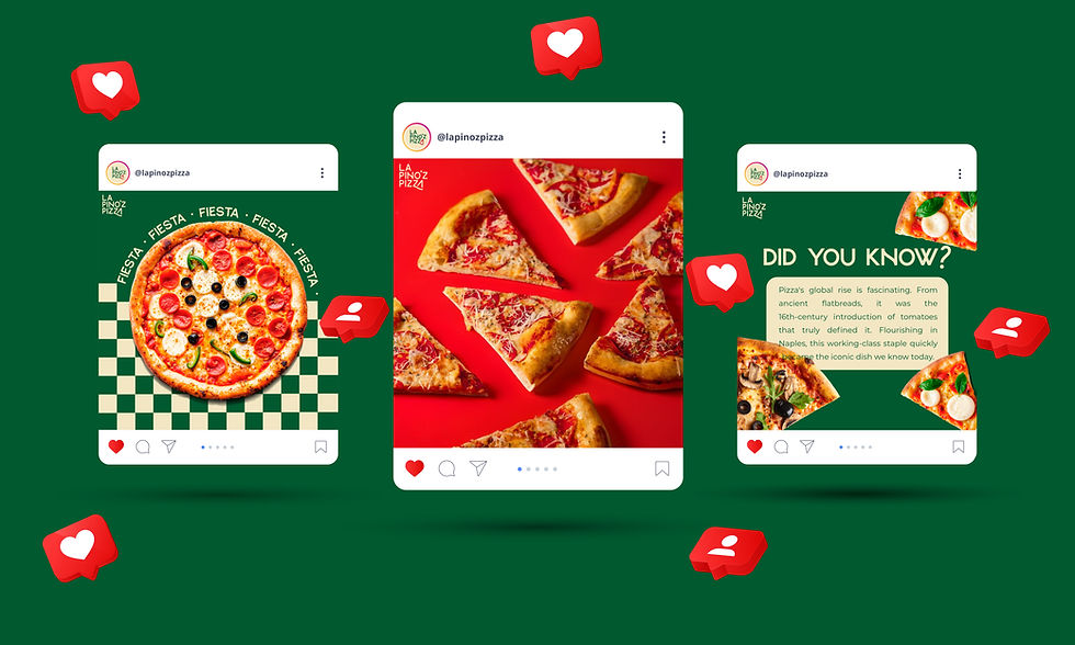


La Pinoz Pizza


The current logo looks visibly cluttered and outdated, which hampers its scalability across different platforms. Furthermore, the logo suffers from an overload of brand colours, and the incompatible font pairings present significant legibility challenges, making them unsuitable for any extended text.
Here's our version:
.jpg)
Our version represents a significantly more modern and streamlined approach. We've prioritized a clean aesthetic with a highly legible font, ensuring the design is both scalable and fresh. To maintain brand recognition while evolving the look, we've subtly integrated a pizza slice motif from the previous logo. This element, now refined and less prominent, continues to acknowledge the offering of individual pizza slices from the brand. Crucially, we've opted to retain the established brand colors, recognizing their vital role in customer familiarity and instant brand recall.


.jpg)